Projects
Internship at Zubax OÜ
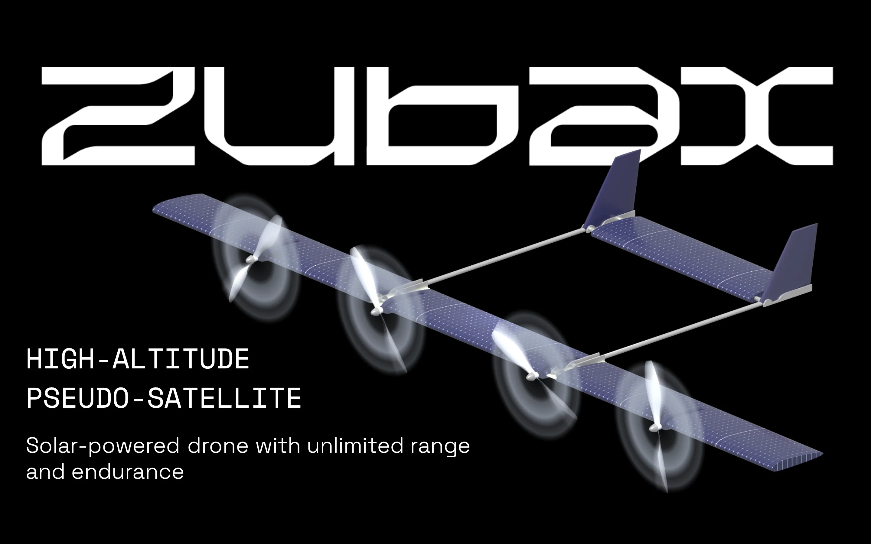
As part of an internship at Zubax Robotics OÜ, a company operating in the fields of high-tech engineering, aviation, robotics, and defense, visual and digital materials were developed to support product presentation and software solutions.
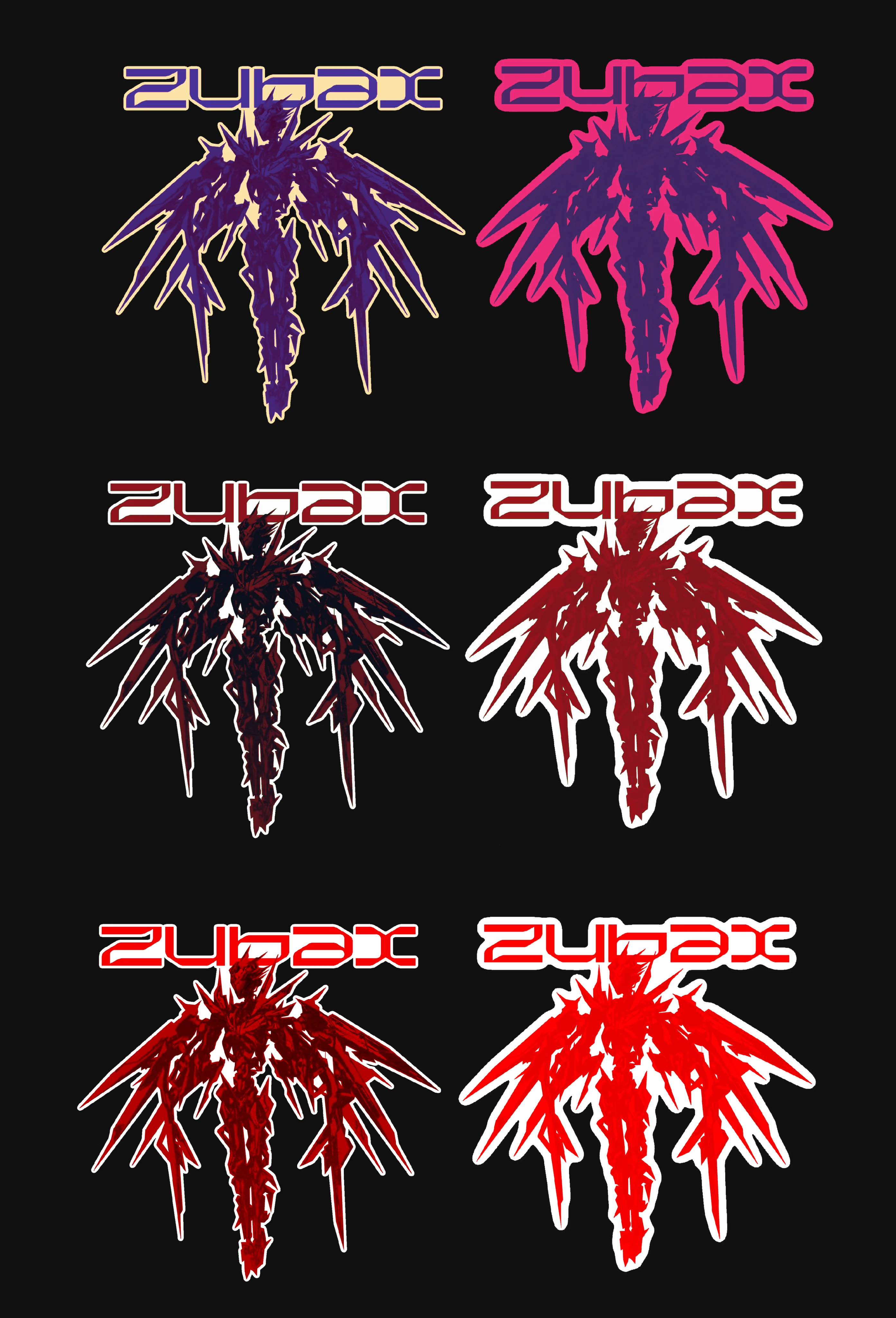
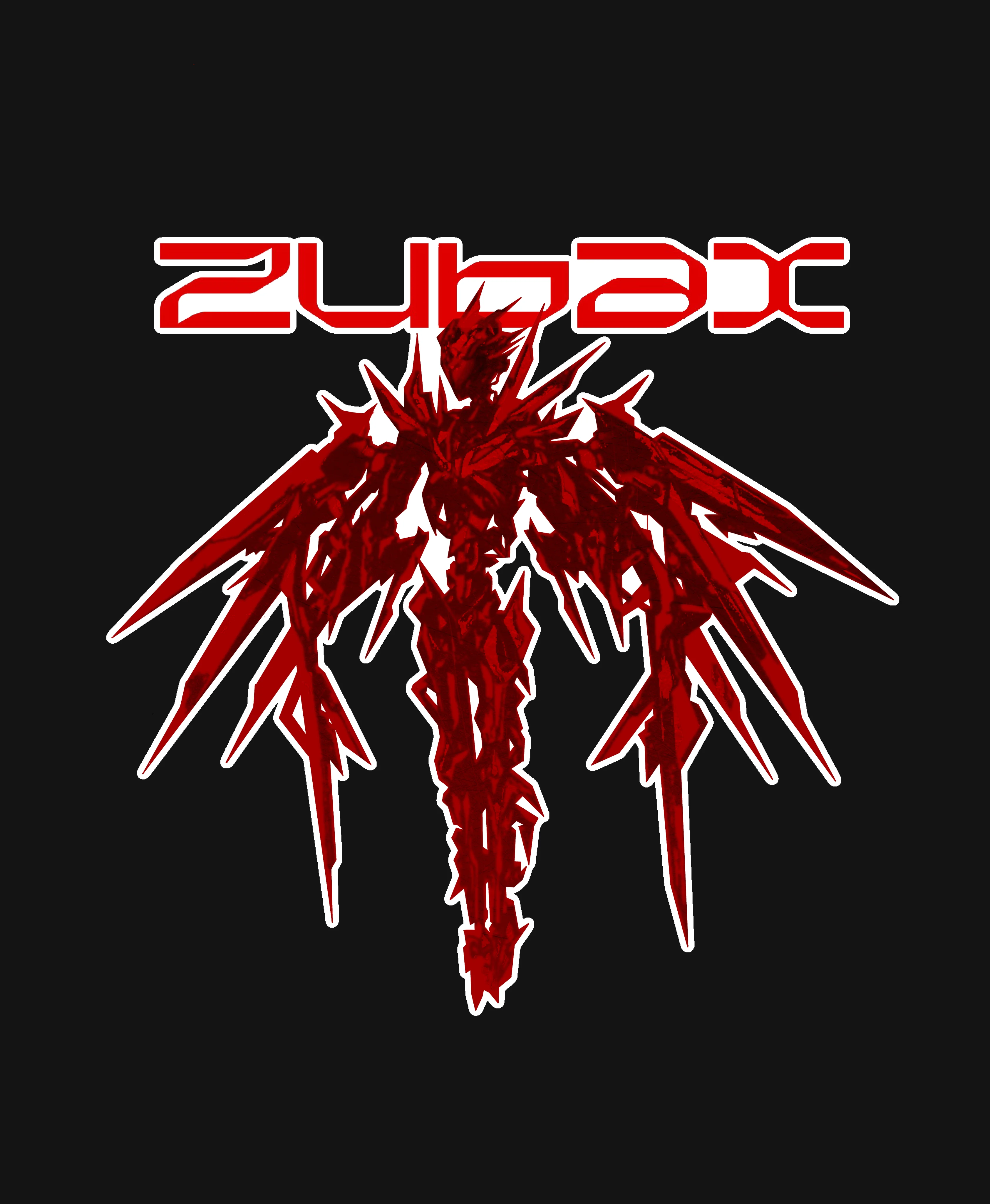
Product packaging stickers were designed to align with the brand identity and reflect themes of mechanics and aviation. The designs incorporate the company logo and follow a clean, technical, and industrial aesthetic.
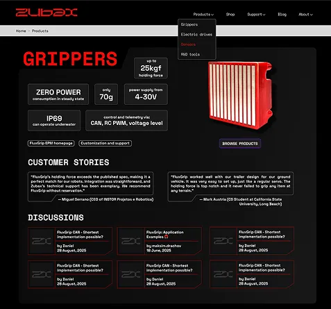
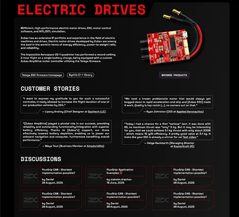
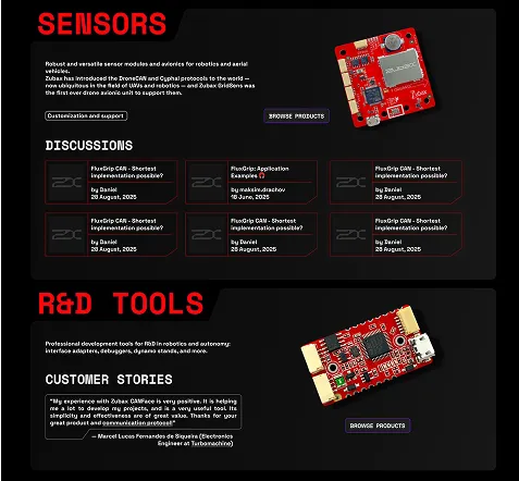
A product-focused website design was created to present each product clearly and structurally, including descriptions, reviews, and discussion sections. The visual language follows the existing style of the company and emphasizes the technological nature of the products.
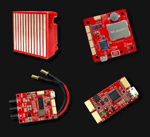
The website features product photography executed in a consistent visual style. Clean, neutral images ensure clarity and highlight the details of the devices.
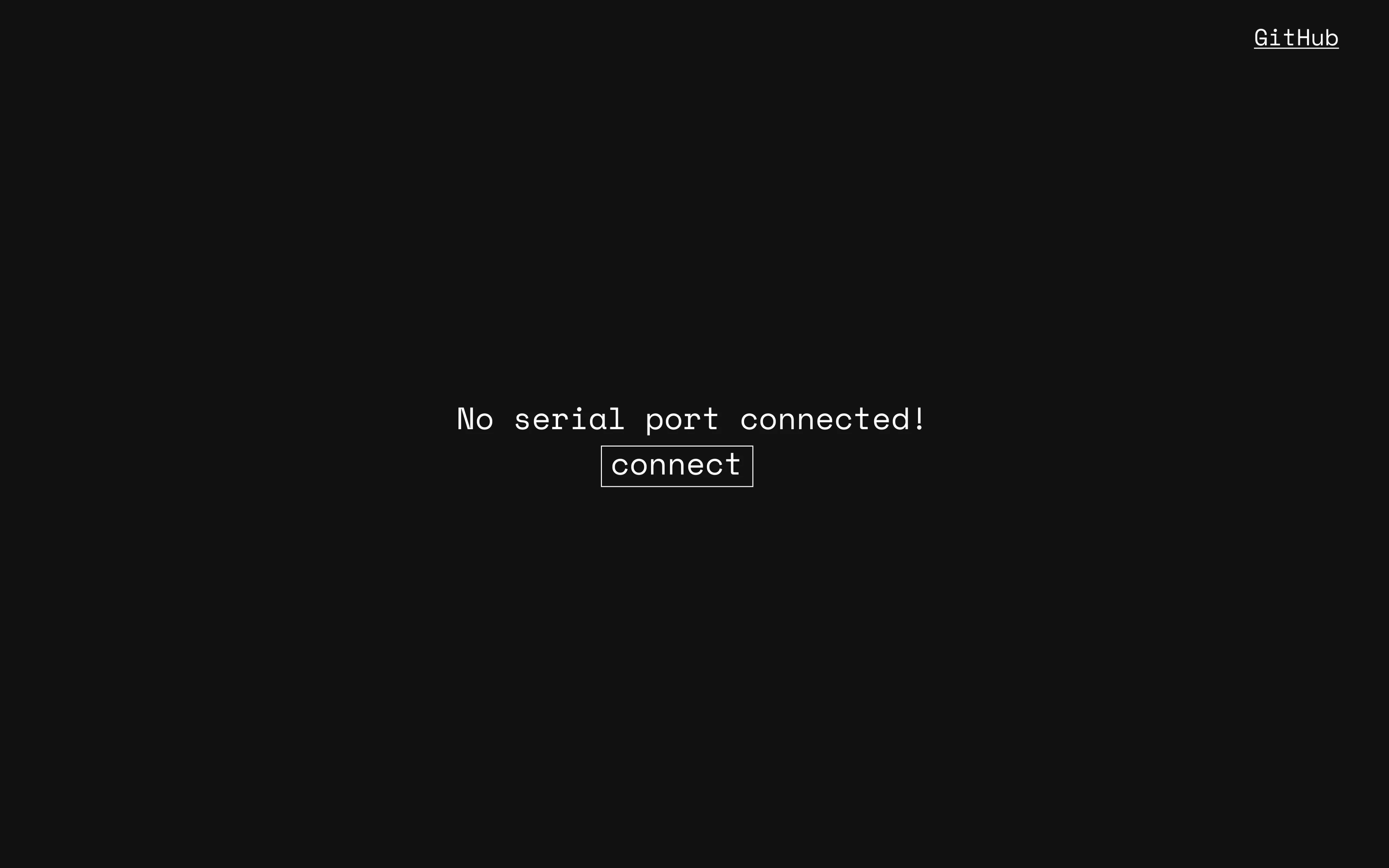
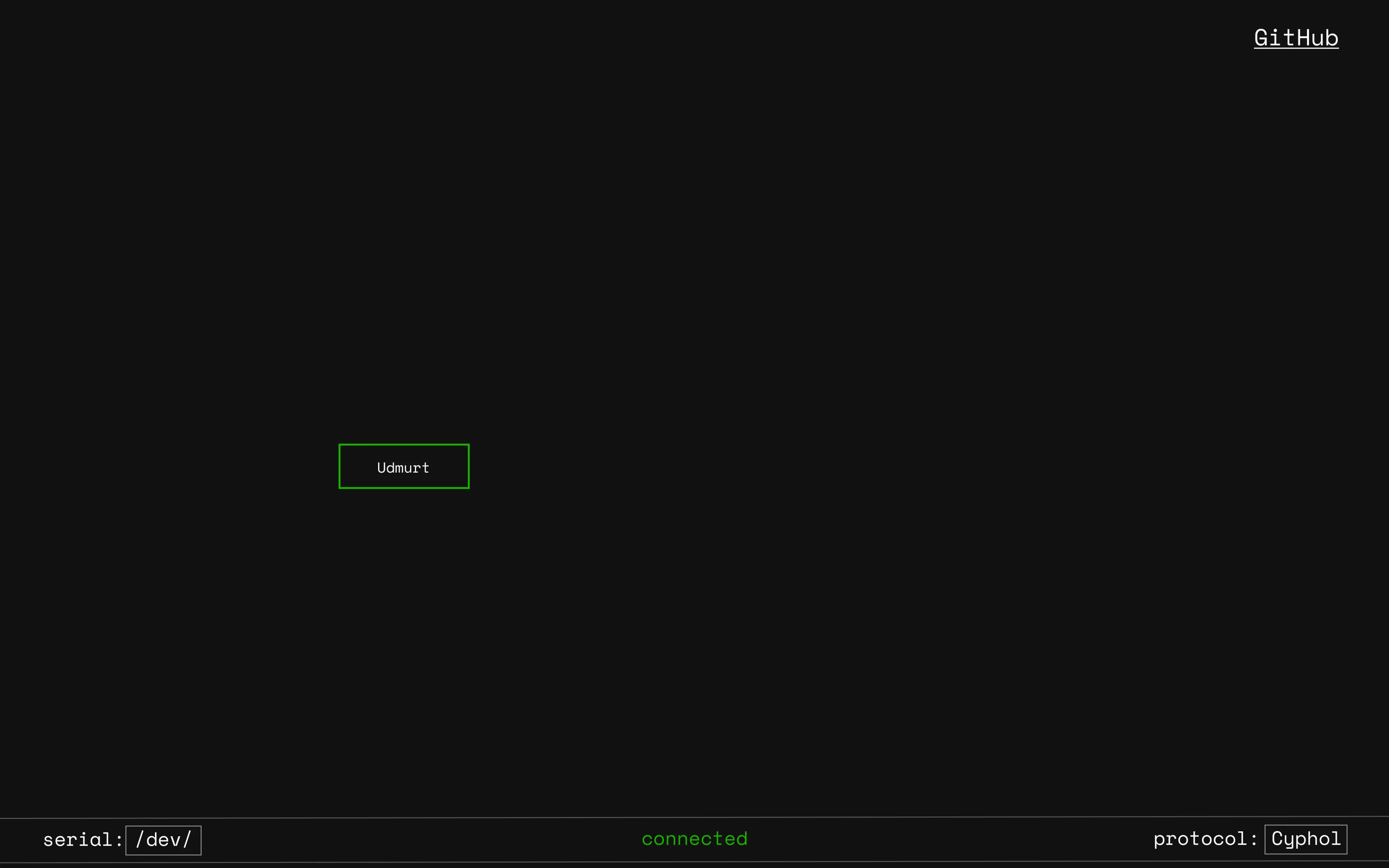
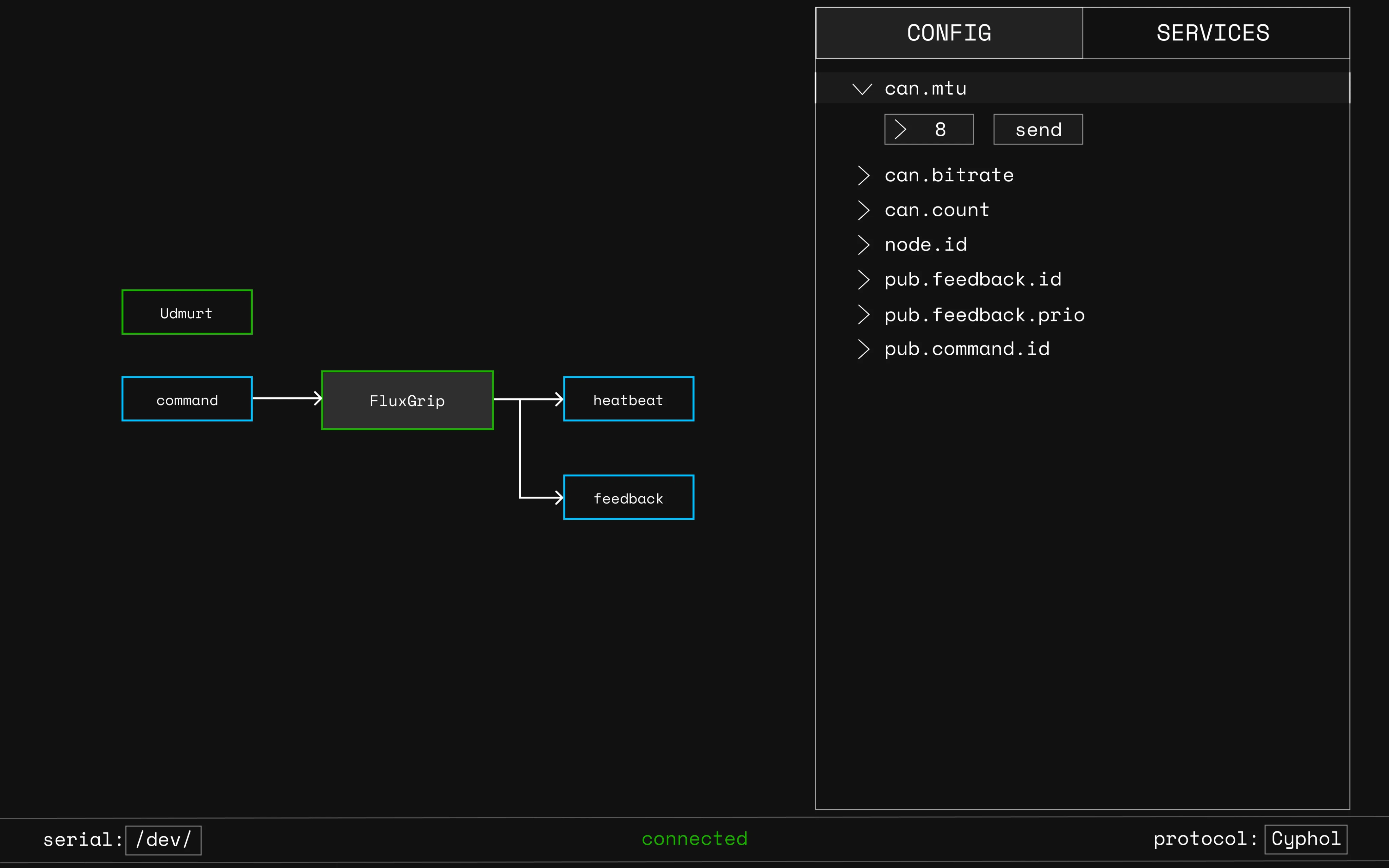
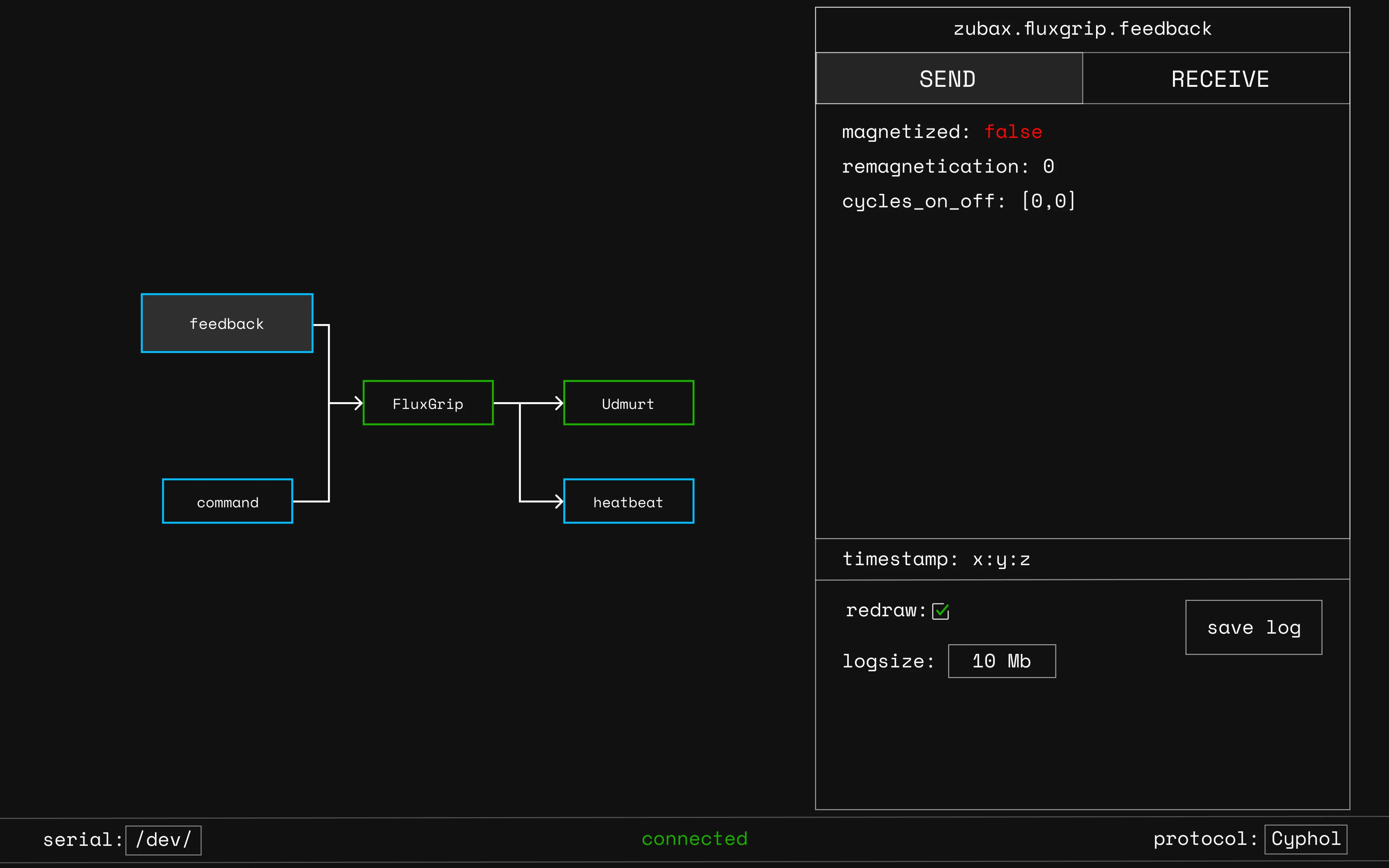
Another project involved the design of a web interface for an industrial control software system, used to connect to devices, control them, and monitor real-time operation directly in the browser. The interface is minimalist and industrial, designed to support future expansion with additional functional blocks and data.
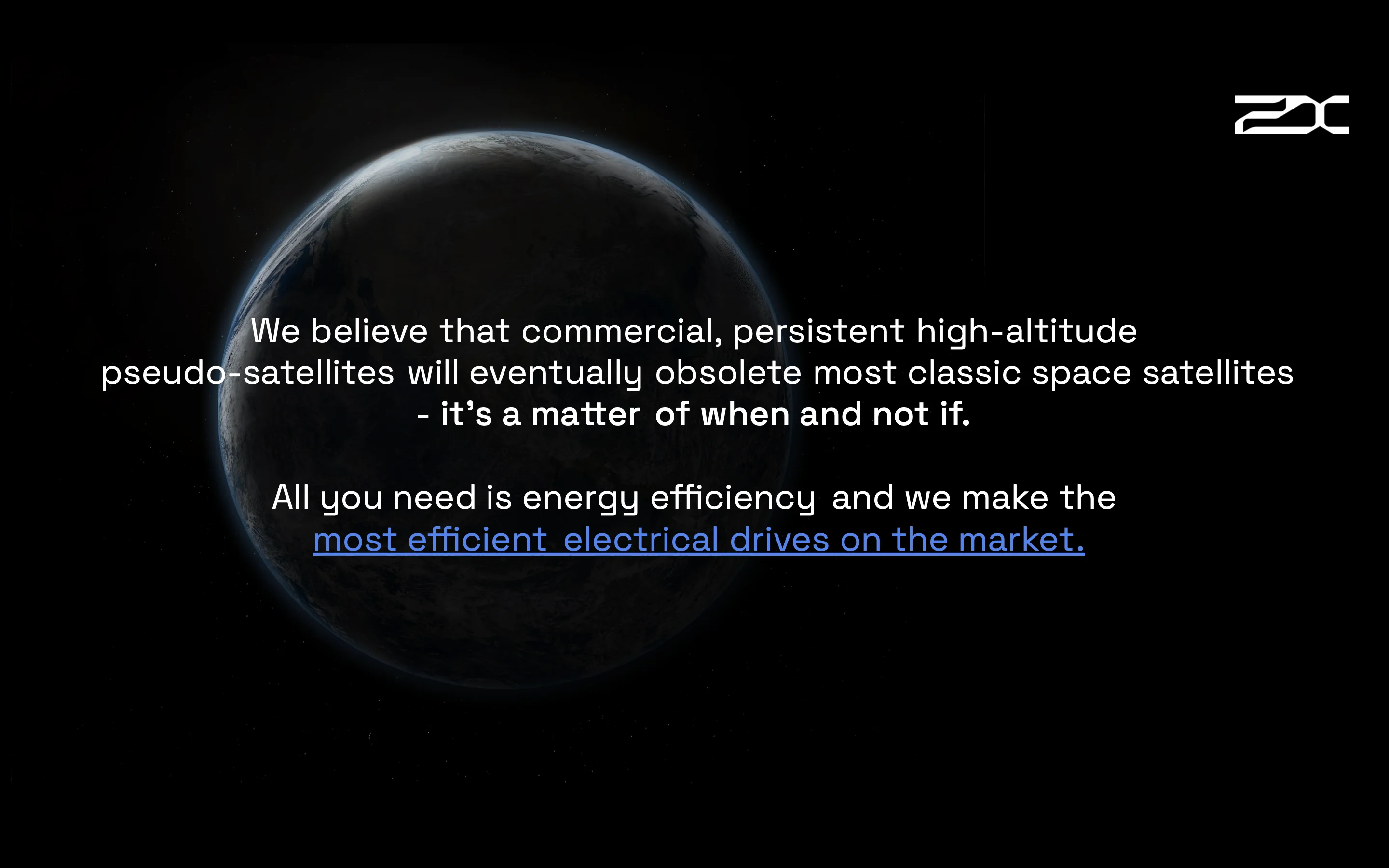
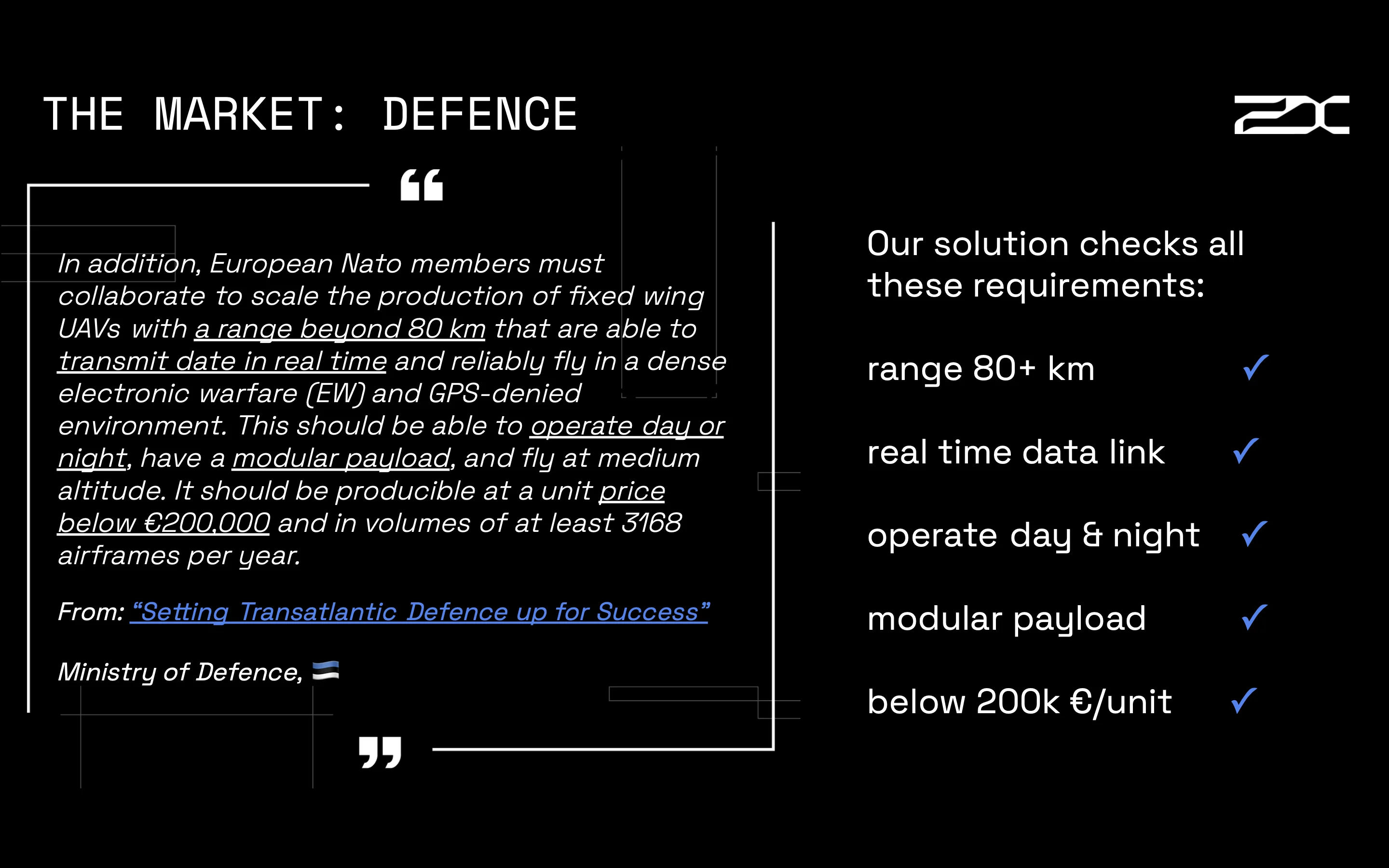
In addition, a business presentation design was developed to support the introduction of a new product and attract potential investment, with a strong focus on visual clarity and impact.

Lemonade Packaging Series
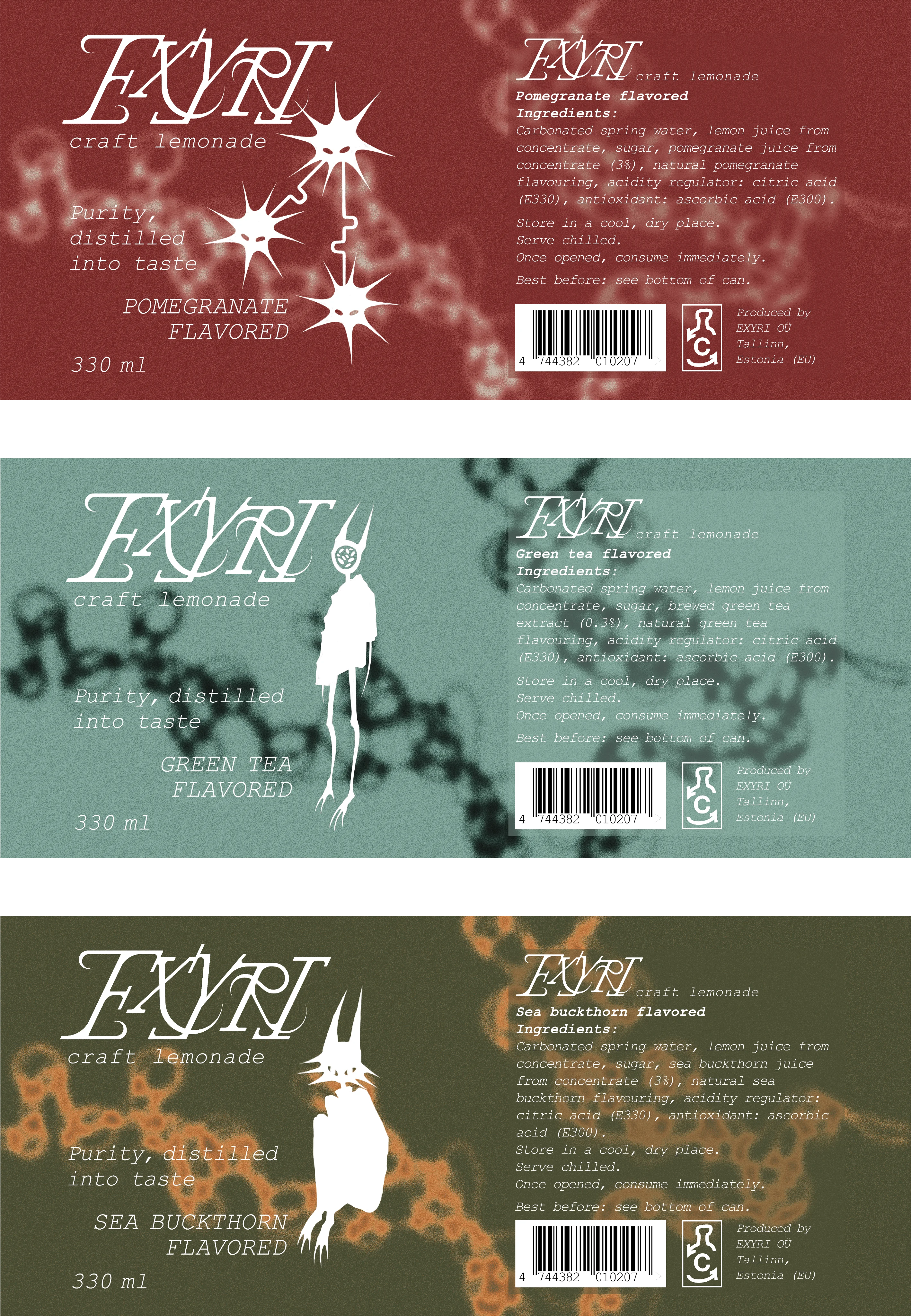
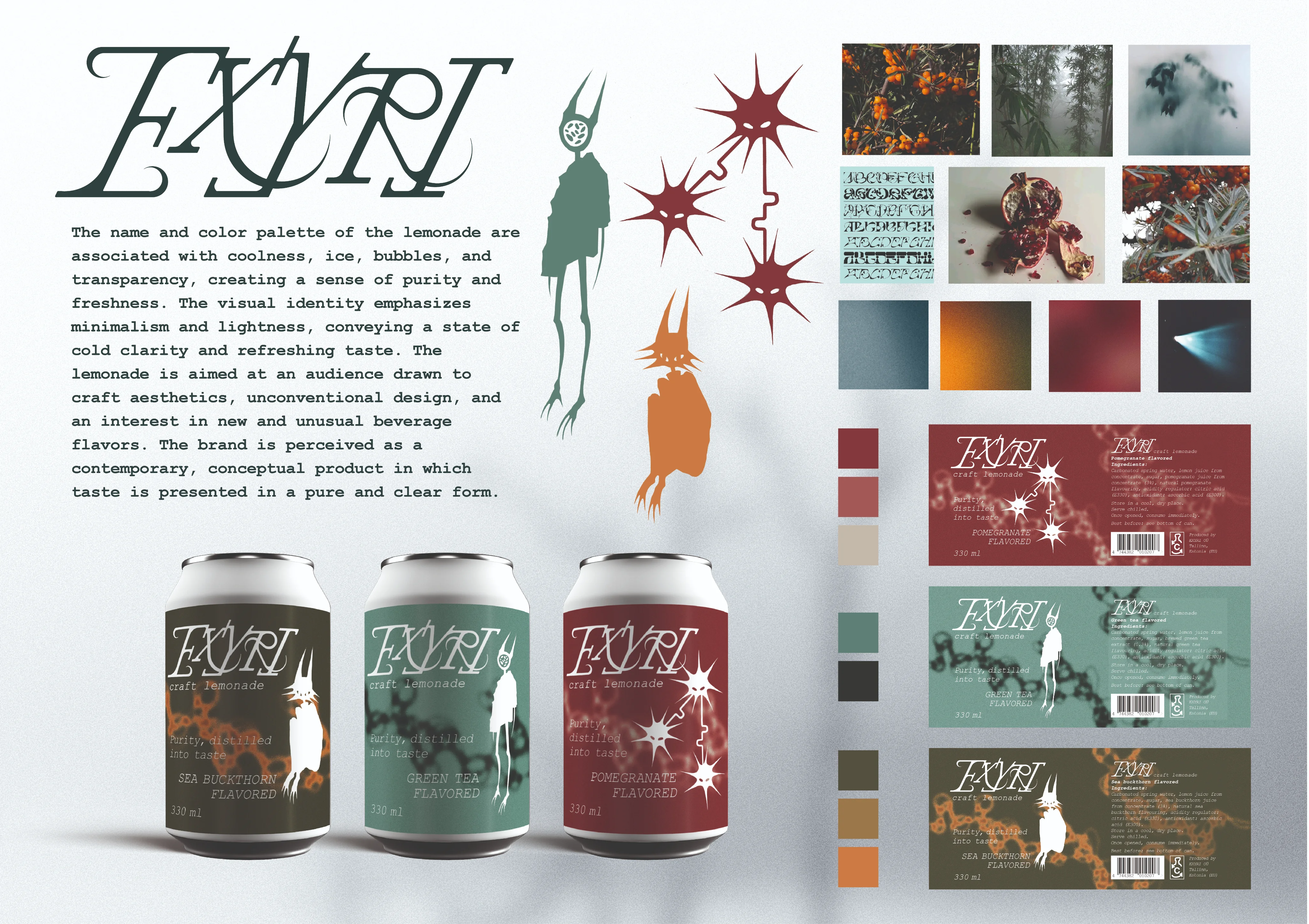
The project involved creating a series of packaging designs for a craft lemonade. I decided to convey a sense of freshness, coolness, and purity through the design, colors, name, and characters for each flavor, making the product appealing to an audience that appreciates craft beverages, unusual flavors, and minimalist, contemporary design.
The name EXYRI was created by me. It evokes associations with coolness, ice, bubbles, and transparency, creating a sense of a clean and refreshing drink. The logo was hand-drawn and then converted into a vector format to ensure clarity and versatility for use across the packaging. The color palette was chosen to convey coolness, lightness, and freshness, with each color variation corresponding to a specific flavor of the lemonade.
For each flavor, I created three characters. They are designed in a minimalist and abstract style to harmonize with the overall design concept. The characters give each flavor its own personality and add an artistic element without overcrowding the composition.

I also selected the color palette and created an abstract gradient background for each lemonade flavor. The colors were chosen to convey coolness, lightness, and freshness, while each gradient reflects the unique character of the flavor and enhances the visual identity of the packaging.
Based on all the elements — the name, logo, color palette, and characters — I developed three separate packaging designs for each flavor of the lemonade.
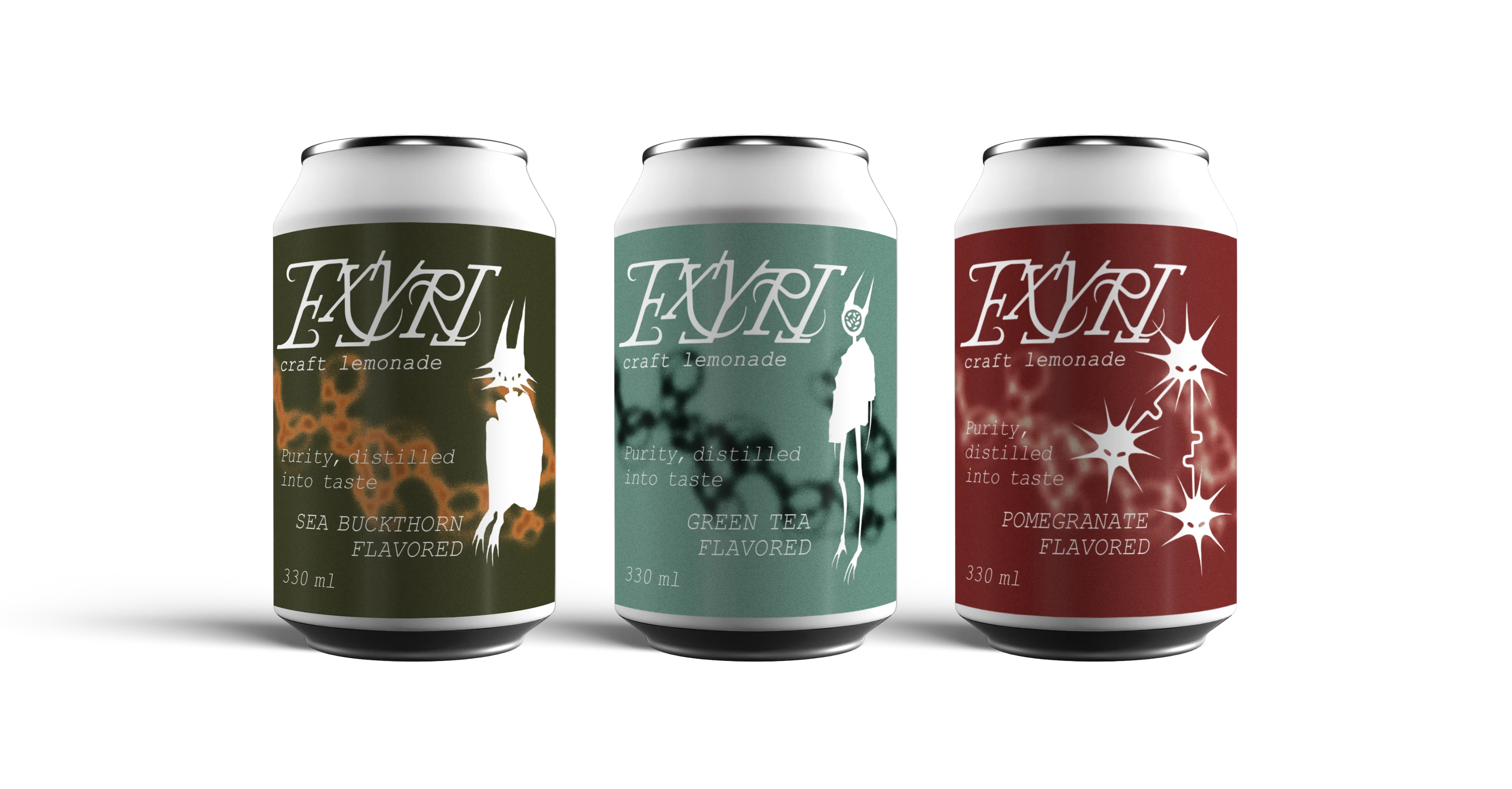
I prepared mockups of the lemonade cans to show how the packaging and characters look in a real-world volume. The mockups help evaluate color combinations, logo readability, and the overall impression of the series, as well as present the product realistically for presentations and portfolio purposes.
All the work was compiled on a single presentation board, visually showcasing the series of cans, logo, characters, color palette, and slogan. The board demonstrates the cohesiveness of the concept and allows the project to be seen as a complete product.
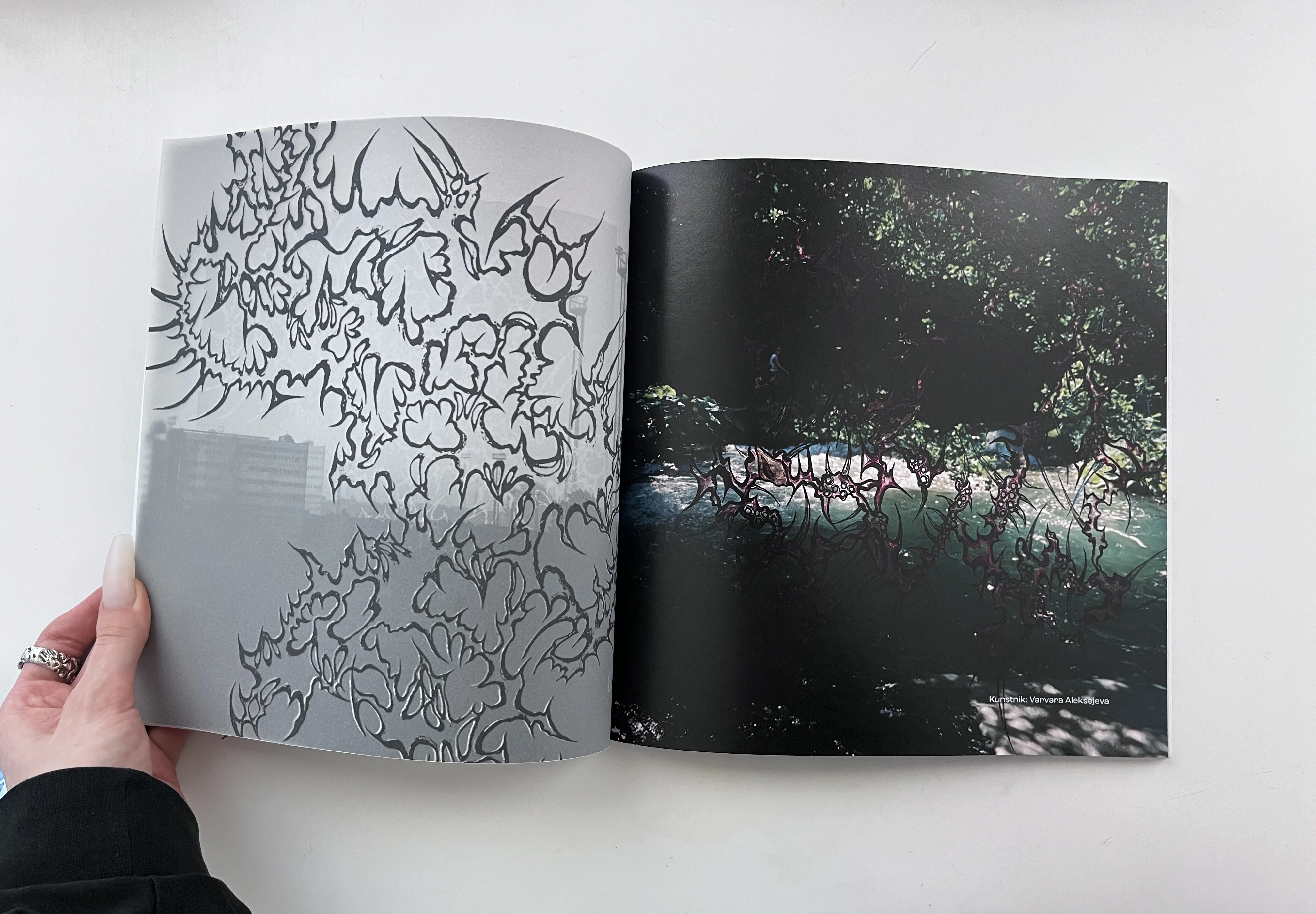
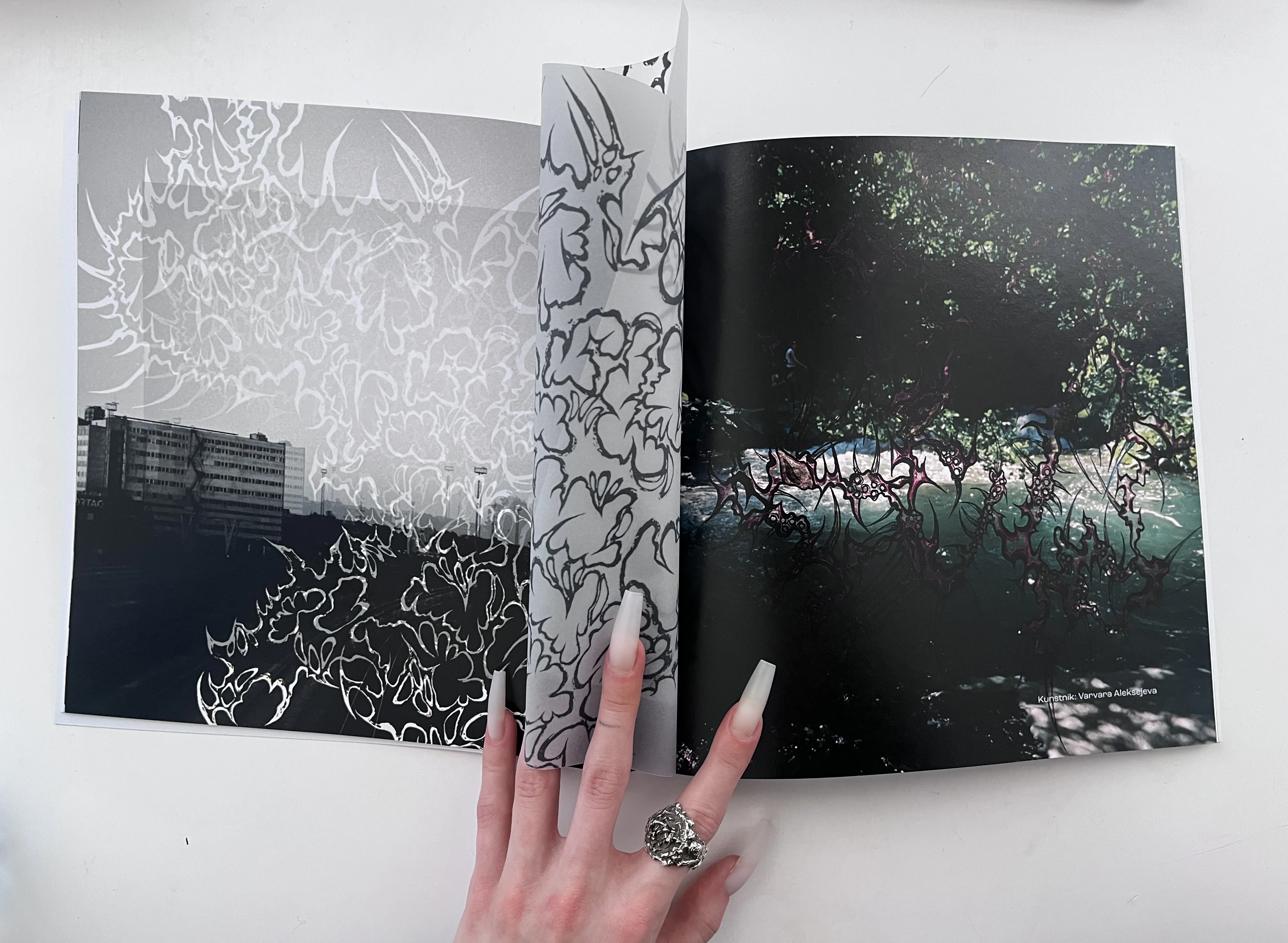
Magazine Spread
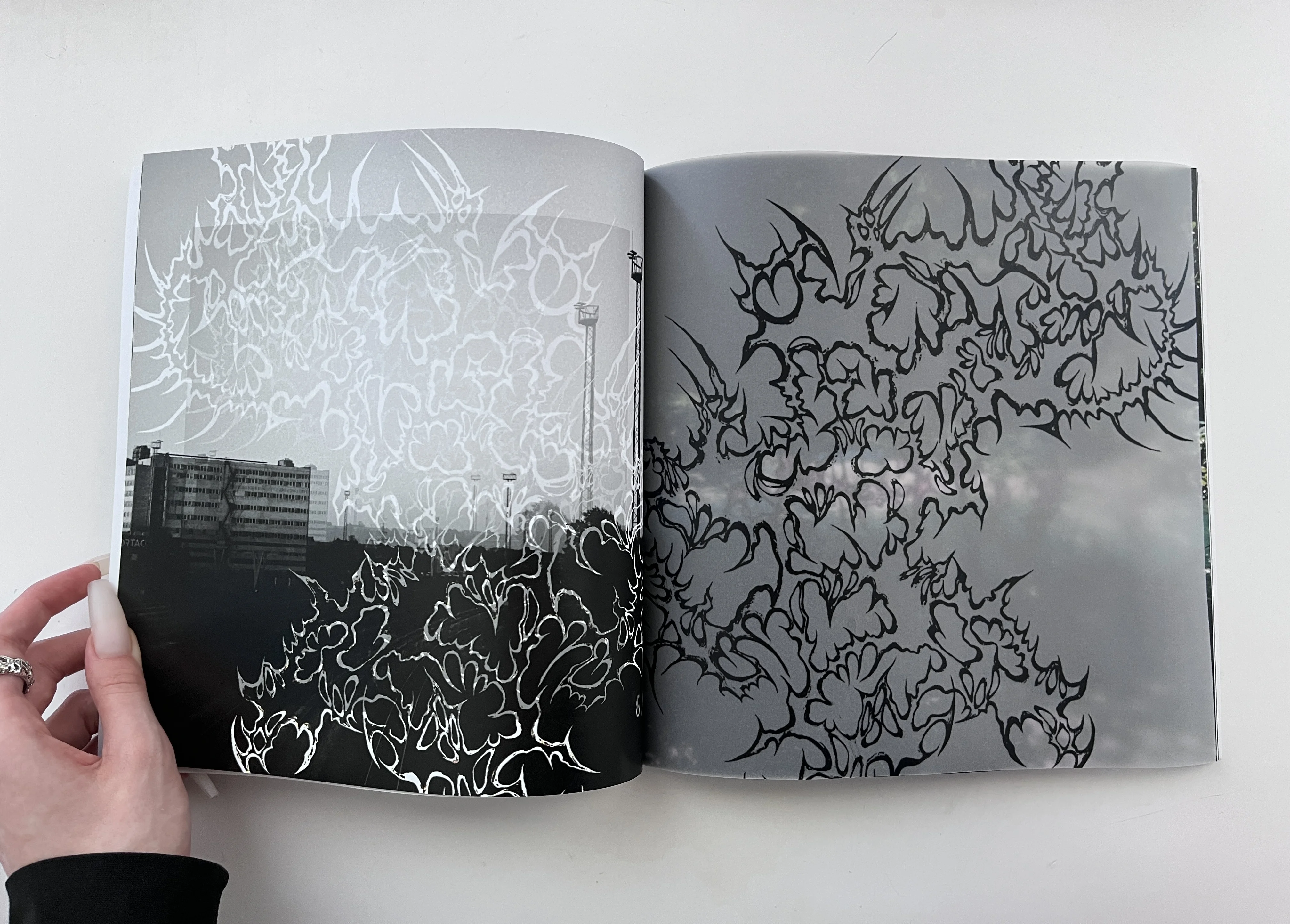
As part of a group project, we created a magazine where each participant worked on their own spread. For my spread, I used my own photographs and illustrations, combining them into collages.
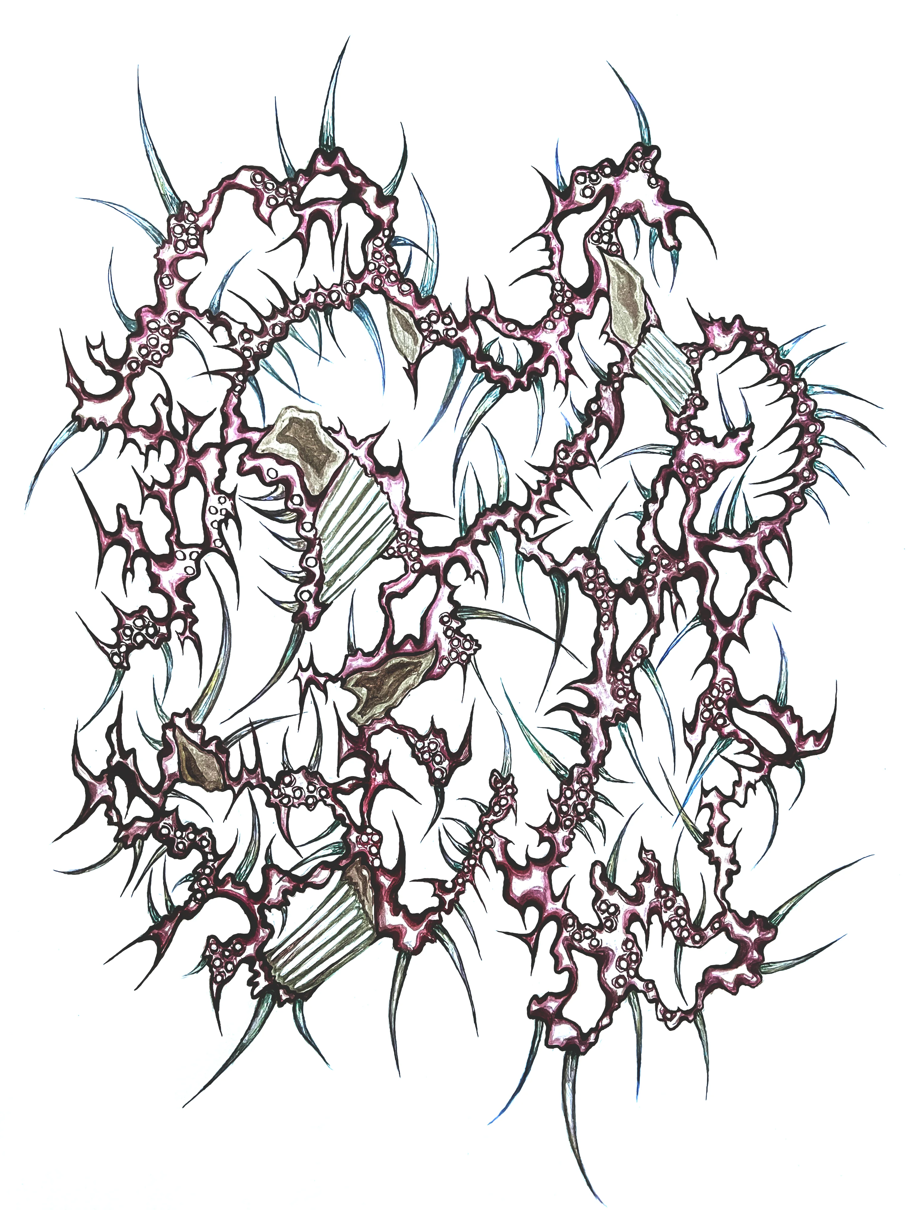
The main idea of my spread was to add a semi-transparent page to create an unusual interactive element in the magazine. To achieve this, I altered the color of the illustration that I overlaid on the images and added an additional semi-transparent layer.
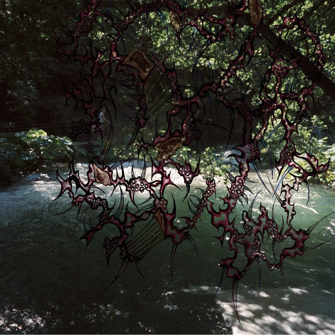
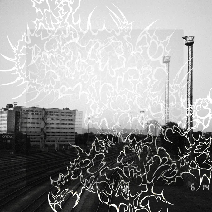
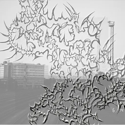
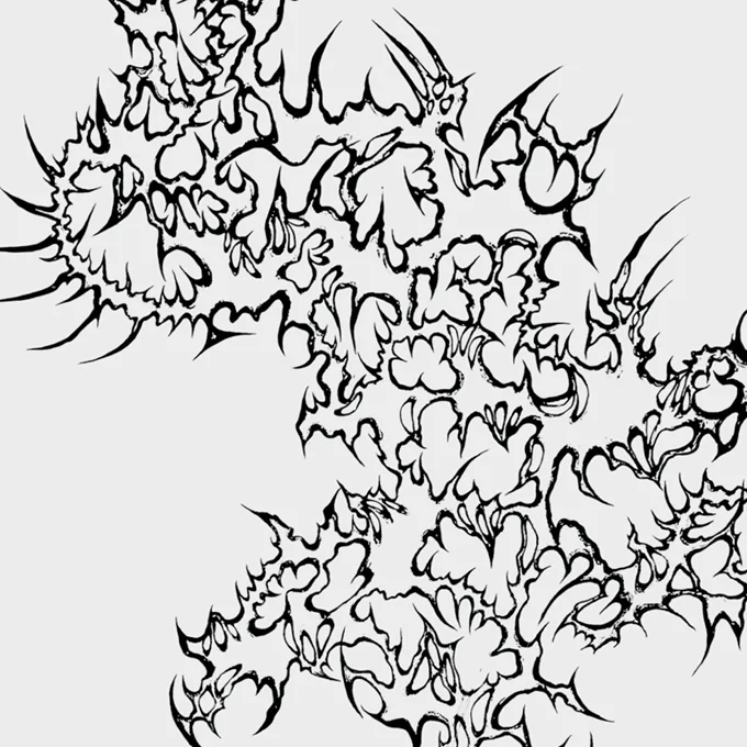
This approach made the spread more dynamic and visually engaging. In the printed version of the magazine, the effect is clearly visible and adds an interactive dimension to the page.
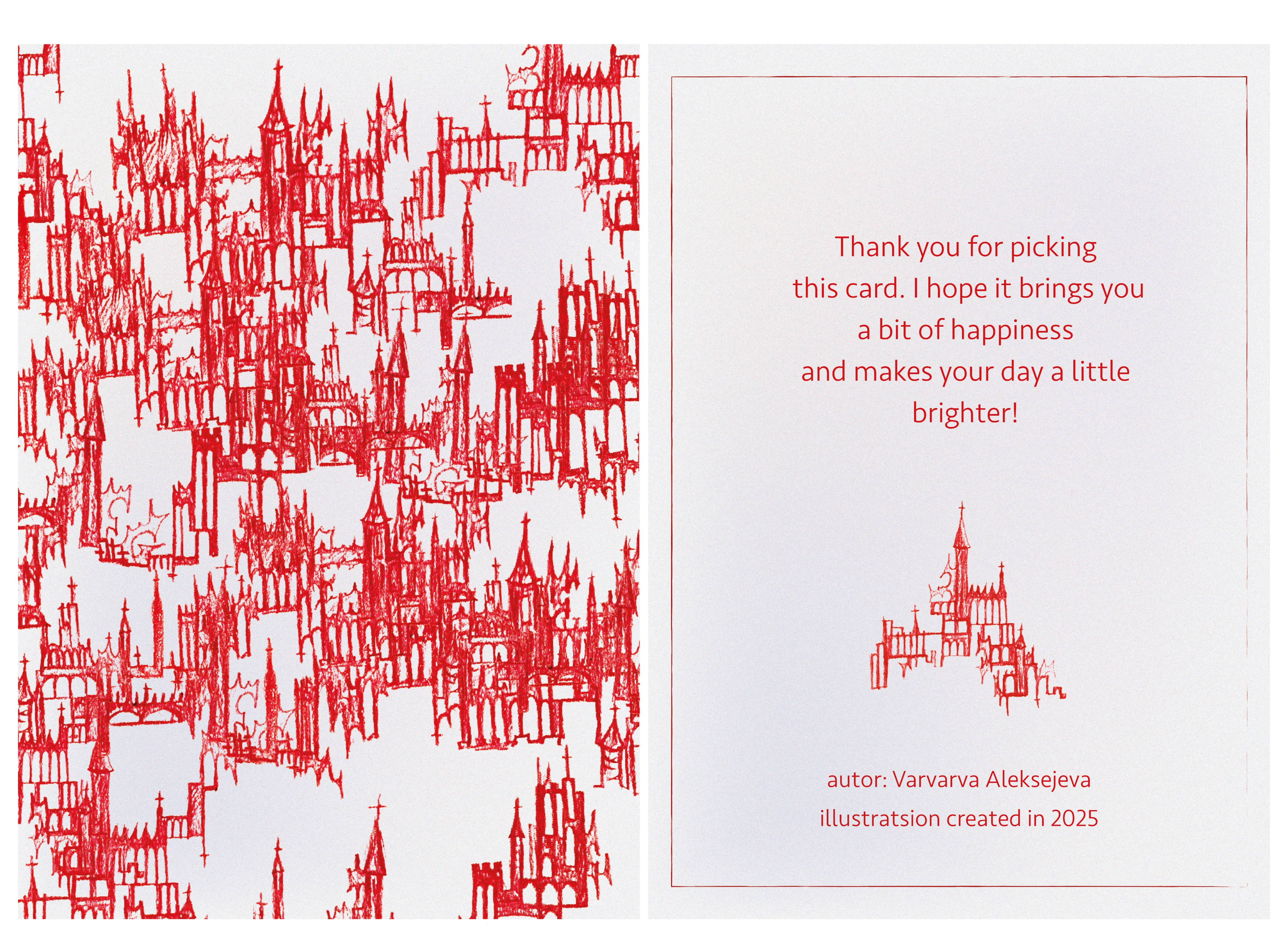
Postcards based on illustrations
Postcards based on small illustrations and pencil sketches. The original drawings are reworked and adapted to the postcard format to ensure a visually balanced and aesthetically pleasing composition. Special attention is given to the balance of elements and proportions, preserving the individuality of each illustration in the final product.